Project Overview - UI Focus
-
Project
Career Foundry - UI Showcase
-
My Roles
UX Designer, UI Designer
-
Duration
October - December 2021
Challenge
Users spend countless hours browsing for gifts because they want to get something meaningful, but do not know what to get the person they’re shopping for.
Solution
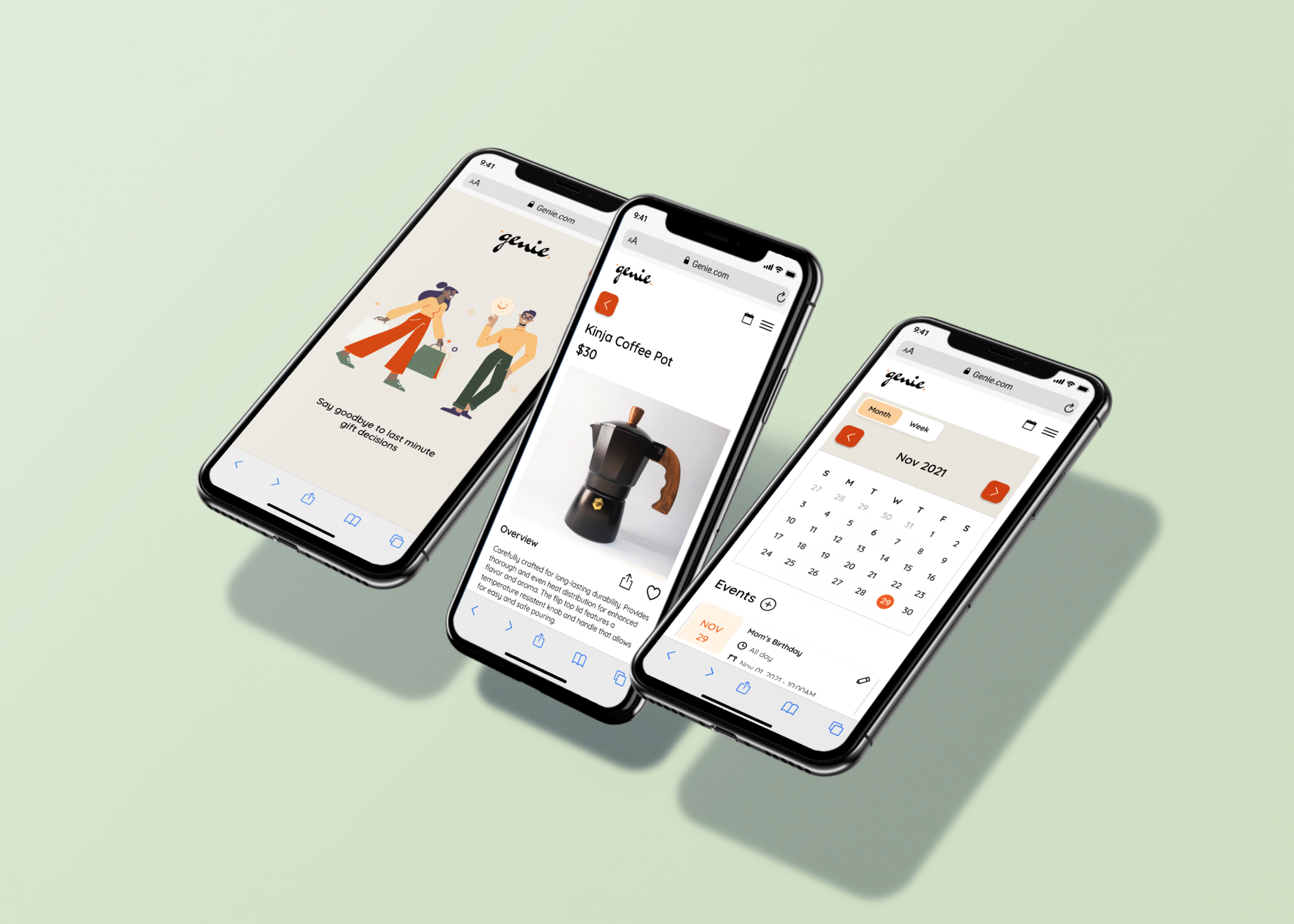
A responsible web-app that gives people gift inspiration and tailored gift recommendations for their friends and family. This app helps users save time, plan ahead for special occasions, and find curated gift ideas.
User Persona
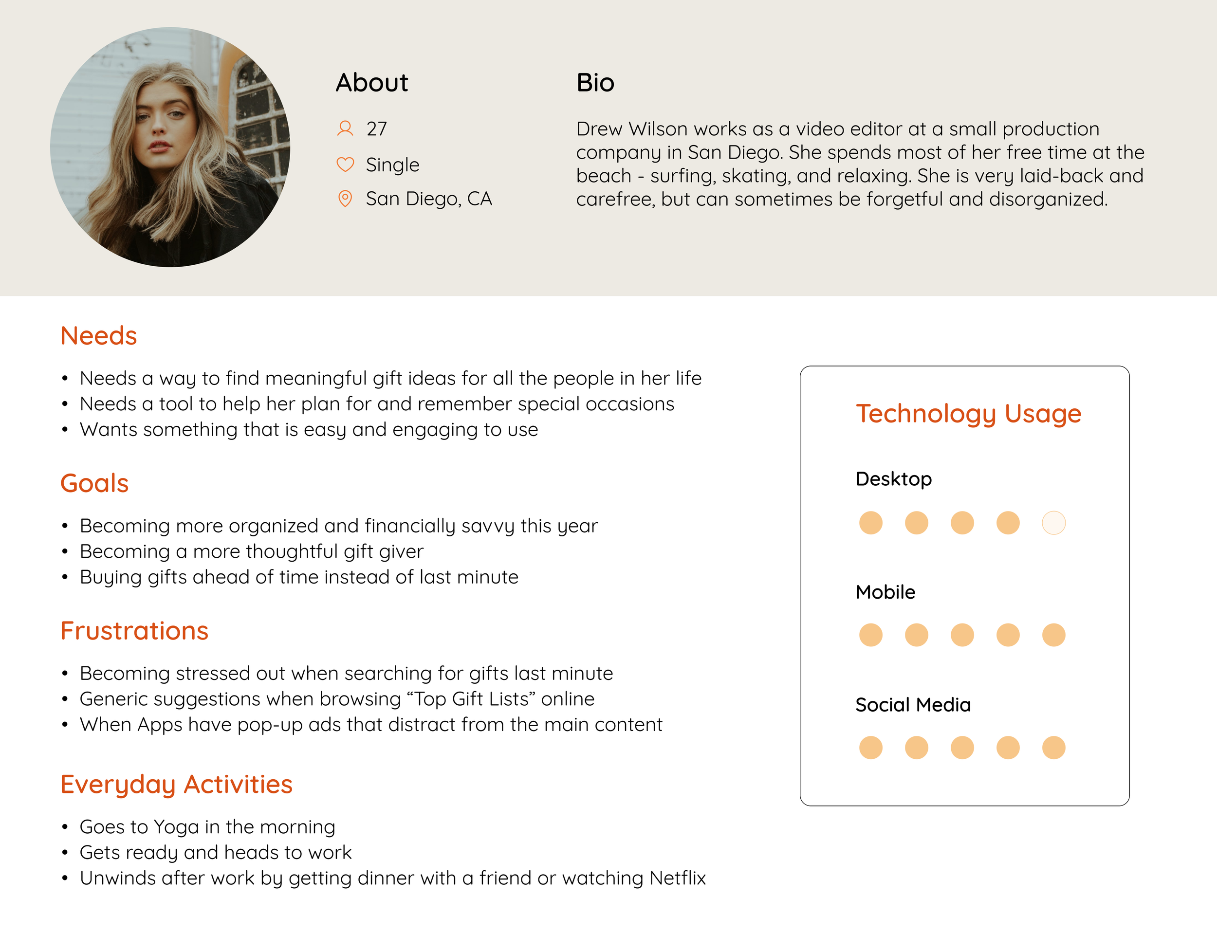
After researching user pain points with existing solutions, I created one main persona to base my app designs off of. I wanted to incorporate the feedback I was seeing about other solutions, so that my persona could be based on data.
Pain Points Users Experienced:
Irrelevant or generic gift suggestions
Distracting features or content
Lack of focus on gift suggestions
Too much time spent looking through long gift lists
User Flows
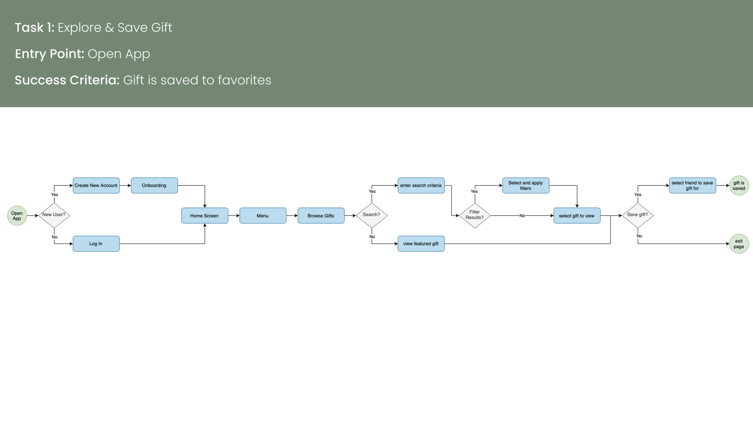
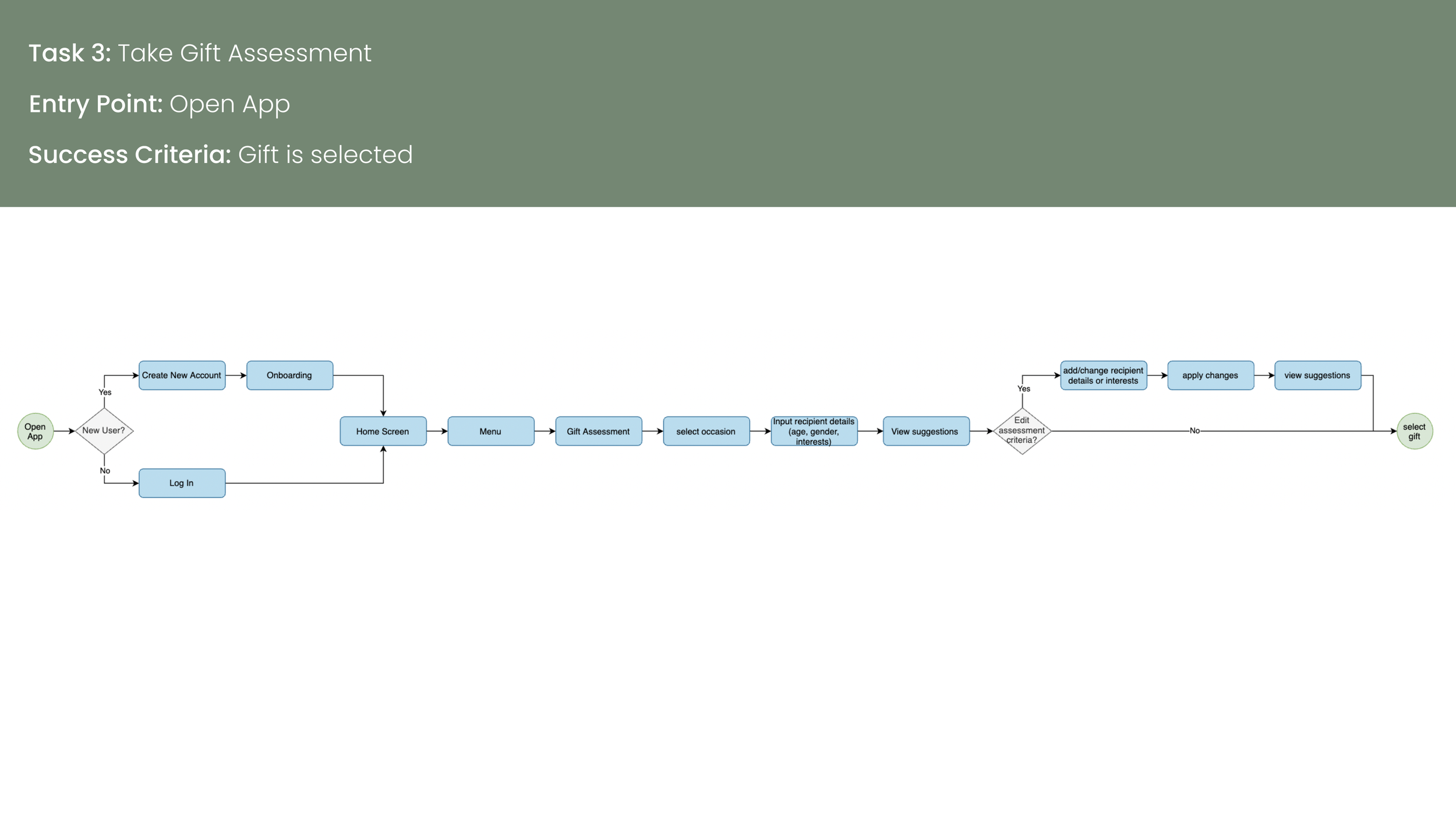
I created user flows to determine the steps a user would take to complete their tasks. I wanted to minimize confusion by making each task simple, and that enabled users to achieve their goals with the least amount of clicks possible.
Low to Mid-Fidelity Wireframes
I created simple, low-fidelity wireframes using Balsalmiq so that I could quickly determine the initial flow/layout of the app screens. Then I transferred my designs to Figma, and added more information and UI elements to the mid-fidelity wireframes.
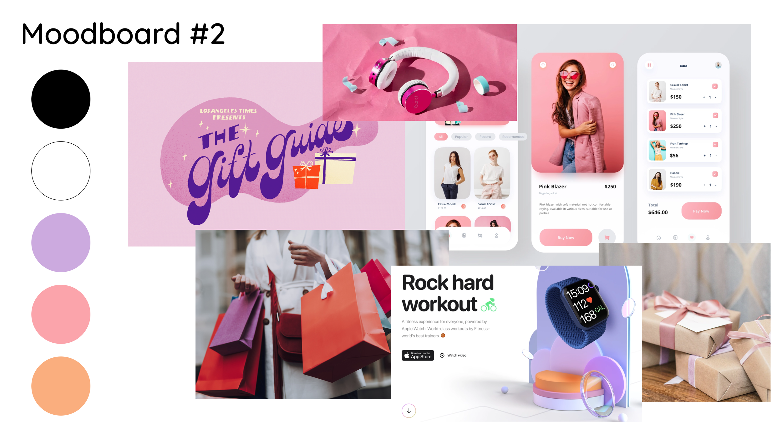
Creating a Moodboard
I created 3 potential mood boards, with varying text styles, colors, and tones. I chose mood board #1 because I wanted users to feel excited while using the app, and orange is often associated with excitement.
Finding gifts can be stressful, and I want users to have a fun and pleasant experience while searching for them. The retro color scheme and rounded fonts will help to create a playful and fun tone.
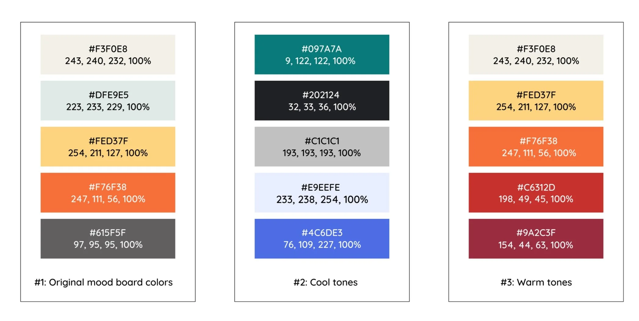
Selecting a Color Palette
I created 3 different color palettes based off my chosen moodboard. I tested each of these on one of the wireframes, in order to decide which option would be best.
I decided to go with Option 1, which incorporates both some cool tones and warm tones because I thought it created better balance and let the retro theme shine through the best.
Responsive Design
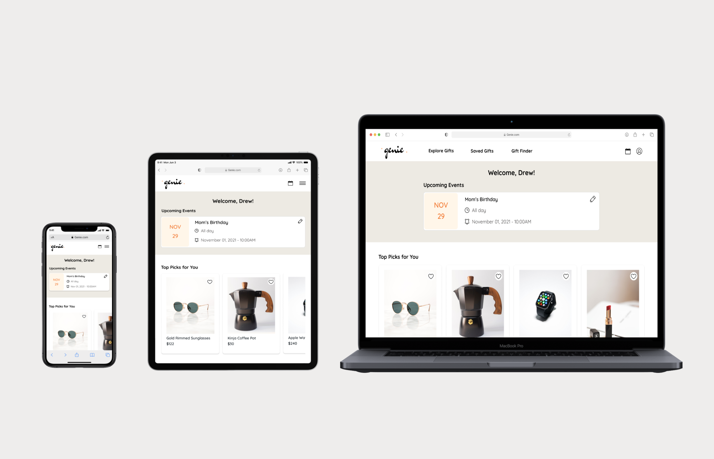
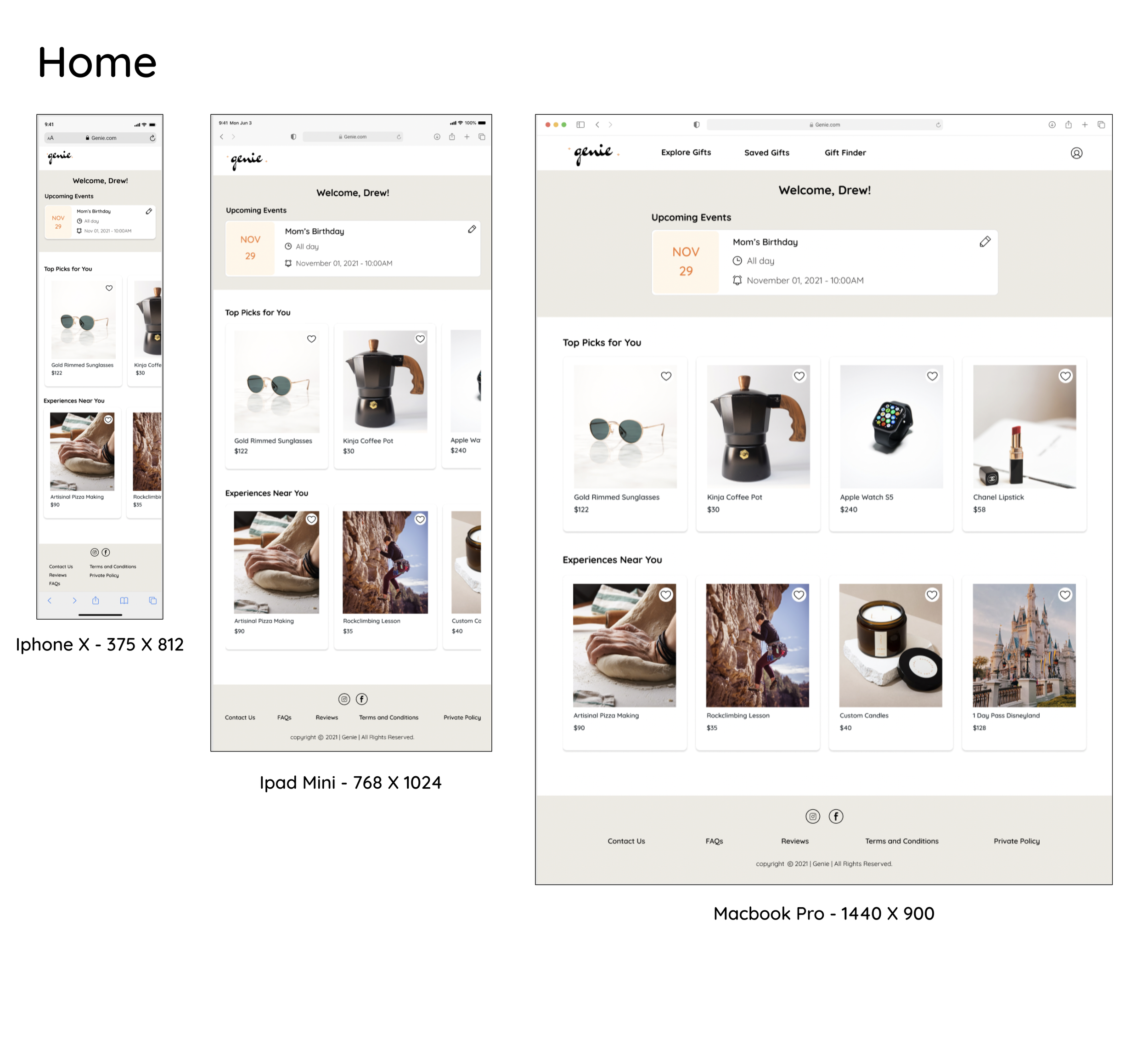
I adapted the mobile designs for multiple breakpoints (ipad mini, Macbook Pro) to create responsive designs that would look good when users access the web app from different device types. Designing for mobile first, then expanding the contents to fit on a larger screen was the most effective method.
Takeaways & Next Steps
I would like to conduct usability testing on at least 5 participants. From there, I will analyze the results and make adjustments to the prototype based on the test findings and user feedback.
During this project, I learned about best practices for designing interfaces, and how to effectively make decisions on color, tone, and voice. I thoroughly enjoyed making these design decisions and working on the styling of an app.
