


Project Overview - UX Focus
Project
Career Foundry - UX Immersion Showcase
My Roles
UX Designer, UX Researcher, UI Designer
Duration
Feb 2021 - Sept 2021
The Problem to Solve
People do not have a solution that enables them to effectively track expenses, split expenses with others, and make online payments all in one place.
Solution
A mobile web app that enables people to shop, transfer money, and more without a debit/credit card or the need to visit a physical bank or store.


Competitive Analysis
Although there are existing companies in the market, there is still opportunity to establish ourselves as a player as it is a constantly growing market as the world becomes more digital.
Key Gaps Identified:
Lack of customization
No feature for splitting bills unevenly
Poor customer service


User Surveys
I conducted a survey to get an initial understanding of features users liked and disliked about current payment apps.
The survey was conducted over the course of 24 hours using Google Forms. 59 Participants completed the survey.

User Interviews
I conducted user interviews to get a deeper understanding of users’ preferences.
The interviews were conducted with 3 participants over video calls. Participants were 24-30 years old and their occupations were a Business Librarian, IT Consultant, and a Financial Advisor.

Key Insights
All 3 participants said they use Venmo the most and attribute that to their friends using it as well.
All 3 participants use payment apps to split expenses with friends - mostly food and beverage expenses.
All 3 participants did not care for the social media aspect of Venmo because they found it to be unnecessary in the context the what the app is used for.
2 out of the 3 participants were hesitant to use cryptocurrency if included in the app because are not familiar with it.

User Personas & Journeys
Key Insights
A majority of people (61%) use payment apps for splitting expenses
67% of people do not care about a social aspect of these apps - this surprised me since most people use Venmo, which has a social focus
49% of people weren’t interested in investing in cryptocurrency within the app
66% chose the bill splitting feature as their top priority


Design Iterations
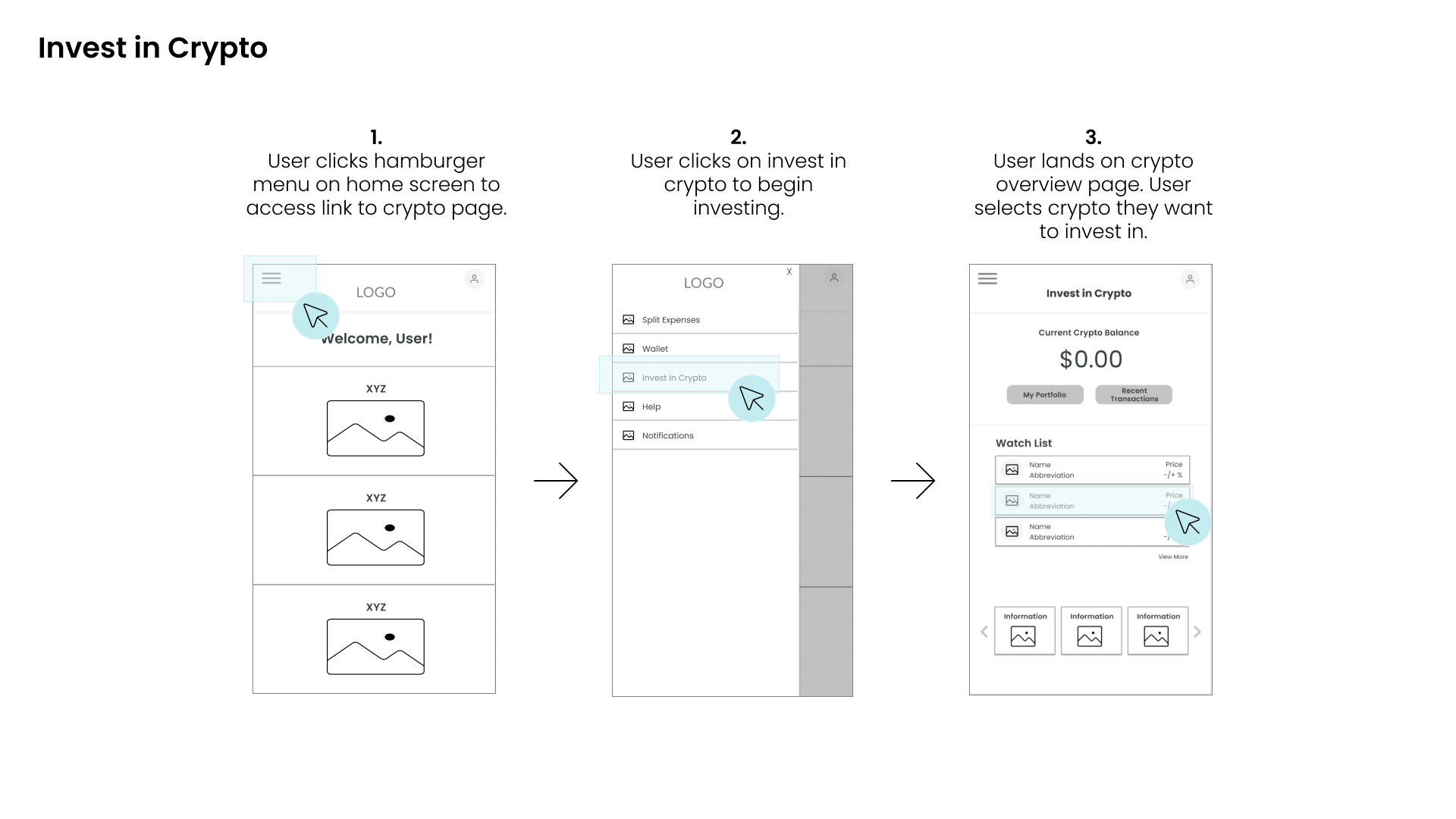
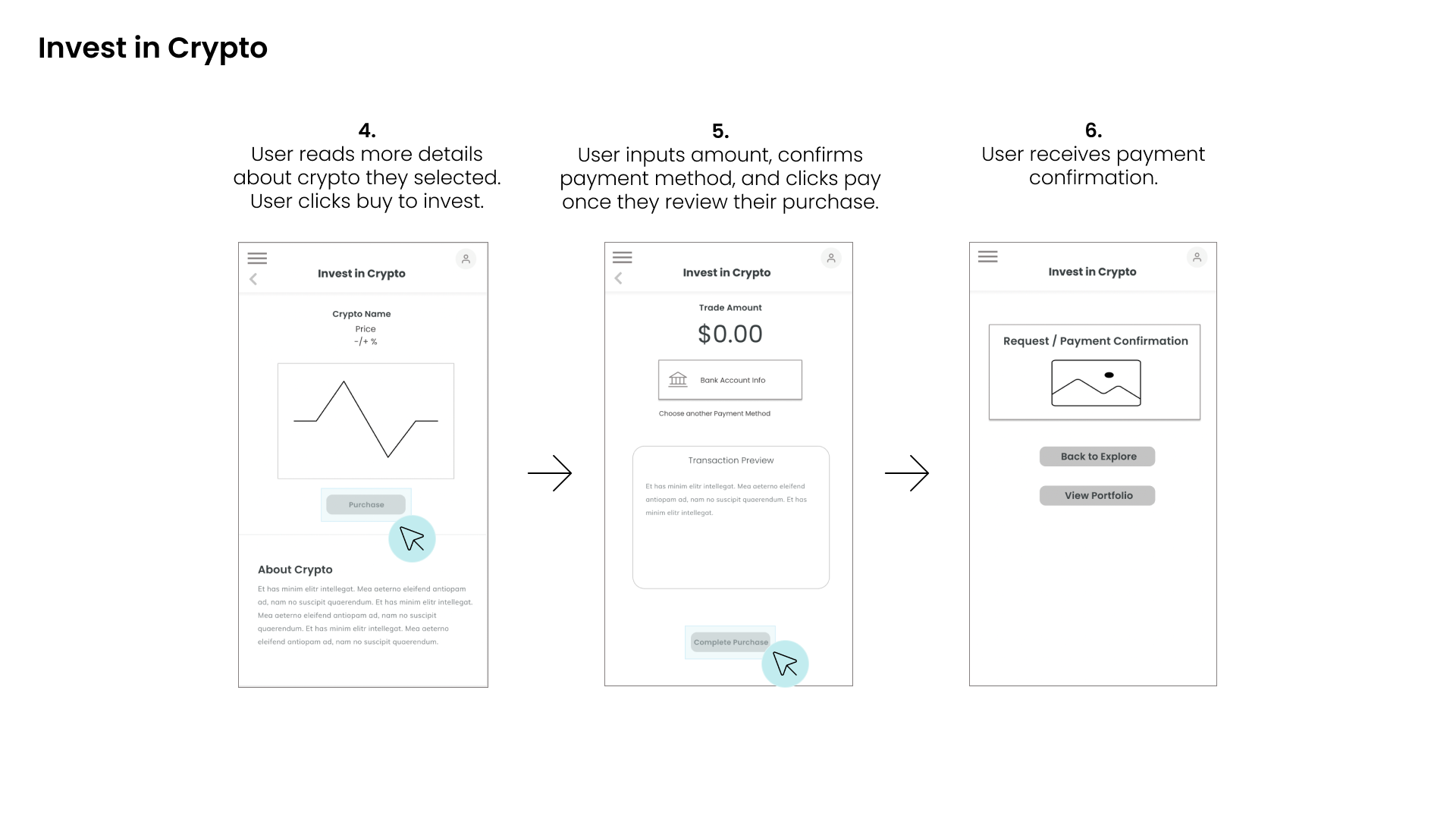
I began sketching out my ideas using paper/pen for 3 core app functions: Payment & request, Invest in Crypto, View Account Statements.
Then I transformed the sketches into mid-fidelity wireframes and began building out more screens with that more page elements.
Once I built out more screens, I started to refine the screens and add in even more details (icons, pictures, sample text) to the wireframes and was ready to start prototyping!

Low Fidelity - Initial Sketches

Mid-Fidelity

Mid-Fidelity
Mid-Fidelity
Mid-Fidelity

Mid-Fidelity
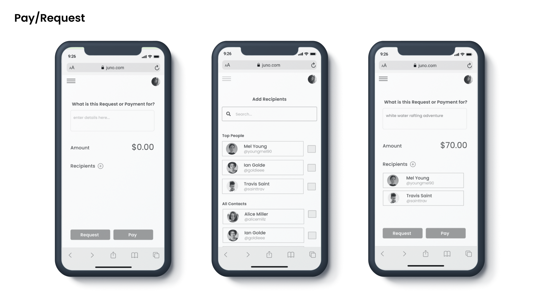
High Fidelity
High Fidelity

High Fidelity

High Fidelity

Measuring Usability
Moderated Usability Tests were conducted with 6 participants in person and over video calls. All participants were familiar with payment/financial apps and were within the target demographic.
At the end of each task, users were asked to rate the task’s level of difficulty using the SEQ scale (1 being really difficult, 7 being really easy).
Key Insights
Participants found task 5 to be the most challenging. Although users found this task to be the most challenging, this feature was the most impressive to them.
Users did not expect account statements to be under the profile icon. I think this was because the other features were in the hamburger menu and users had expected this feature to be there as well.


UI Design
Using Color Strategically - Blue and Purple will be used as the main colors to promote a sense of amazement, security, and serenity. Blue will be the dominant color throughout the app as it promotes a sense of trust in the brand.

Developing Personality - We want users to feel comfortable using the app. Financial applications can feel dry and serious — we’ve included colorful illustrations to make the app feel more approachable to users.
Rewarding Users - We’ve incorporated a referral incentive on the main page of our app. Users will be likely to refer to a friend if they enjoy using the app and know they’ll get an extra bonus by doing so.
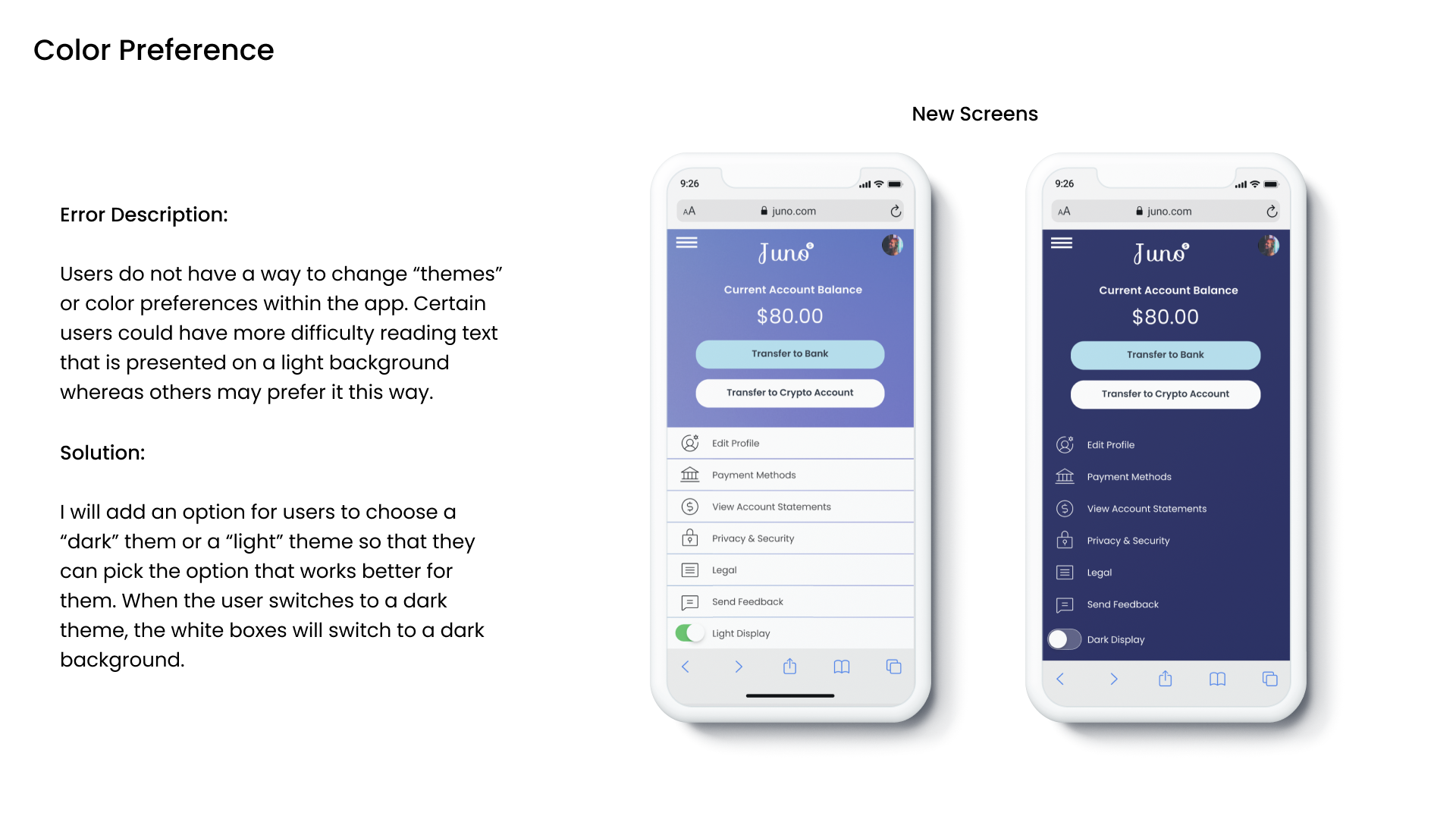
Improving Accessibility
A number of pages were enhanced by improving accessibility. I referenced the Web Content Accessibility Guidelines to measure my designs against.
Accessibility is important because I want the app to be usable by a diverse amount of individuals and do not want to exclude anyone from using it.


Takeaways & Next Steps
I have learned quite a bit during my time working on this project and have enjoyed every part of it. Specifically, I enjoyed interacting with users and thinking creatively.
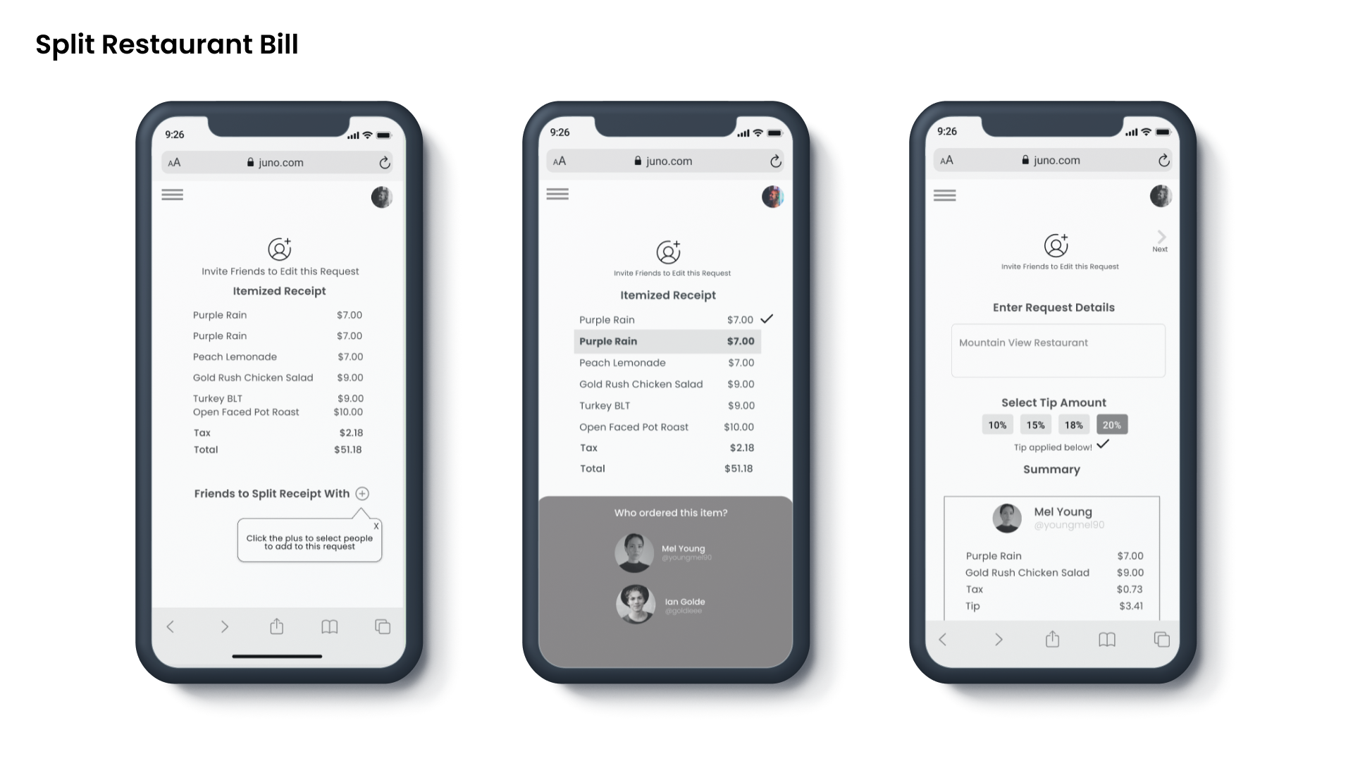
I would like to continue improving the functionality of the restaurant bill splitting feature, as this is the feature that is most directly addressing the user need.